The Principles of Good Design
Design touches every part of our lives in extremely powerful ways, but often the best designs are the ones that feel so intuitive and natural that people don’t even think about them. As a result, many people - including aspiring creatives - don’t consider how critical a role design actually plays in producing effective professional work.
The Role of Design
Design matters in print, on a TV screen, on the webpage, on stage, and in the physical world of the objects we touch and interact with.
The simplest way I can describe the significance of design is to say that it has the power to control what you see, what you understand, and even dictate how you interact with the world around you.
A good design communicates the designer's intent and creates clarity and focus for the intended audience.
By contrast, a bad design lacks clarity, does not focus the viewer or user's attention, and leaves the audience confused. This can mean the difference between an advertisement flyer that gets people to attend an event or come to your store and one they pass by and ignore; it can mean the difference between a website that quickly allows people to find the information they want and leads them effortlessly towards becoming a customer (ie. buying a product, signing up for an email list, becoming a regular visitor, etc.) and a website that is confusing and impossible to navigate; it can mean the difference between your end users picking up a product you've created and being able to immediately understand how to use it and your end users finding the product to be cumbersome and difficult to understand.
The impact of design is felt throughout our lives. In her book, "Beautiful Users: Designing for People", Ellen Lupton describes dozens of cases where innovations in design reshaped human society.
For example, subtle changes to Henry Dryfuss' original design of the Bell Model 500 rotary phone by John E. Karlin virtually eliminated misdials and sped up people's dialing time by nearly a second. All Karlin did was move the numbers to the outside of the finger holes and add white dots to the inside that served as "aiming targets" for the user, but that was enough to significantly change user behavior.
Even the way we open and close a door is a product of design.
If you've ever pushed when you should have pulled or pulled when you should have pushed, your mistake was probably caused by the design of the door itself miscommunicating the specific action needed to make it open or closed.
Consider: Since there's no way to pull on it, a plate on a door generally signals us to push the door open while a bar or a handle signals the need to pull. But what if a door has a plate and a handle? What if it has handles or bars on both sides? What if it has two plates? In these cases, the way we're supposed to use the door isn't clearly or easily discoverable" to the average user, and as a result, we're likely to get it wrong.

We now call these kinds of doors "Norman Doors" in reference to product designer, Don Norman who coined the terms "discoverability" and "feedback" as they apply to design.
Discoverability is simply the degree to which a product's use is intuitive. Can we quickly and easily discover how to interact with it effectively, or not?
Feedback is an element of a product's design that allows us to know whether or not we're using it the right way. Did the doorbell ring when you pushed the button? Did the lock click into place when you turned the key? Did the microwave chime when its timer was done? These kinds of questions are a part of the designer's role, and any designer must think about them and take them seriously.
Likewise, in the realms of print, web, and video, design can affect not only how people interact with a graphic, but also for how long, and it can play a major role in how much information from it they retain.
And just like with product design, there are all kinds of questions a designer should be thinking about when creating work for print and digital mediums: Is the design legible? Will the viewer immediately know where to look and what to look at? Will they be able to understand and process the information you're trying to convey quickly? Is the tone of the design relevant to the experience you're trying to project? Is the style likely to be recognized and enjoyed by the intended audience or will it put people off for some reason? Does any part of the design seem unintentional or haphazard or does it seem to be clear and focused?
The more a designer can think through these kinds of questions and be intentional about the designs they create, the more control they will have over the user's experience. And in the end, that's the whole point!
Let's look at a few examples of different kinds of print and digital designs:


If I had to pick one overarching theme to describe bad design, it would be summed up with one word:
“confusion”
The first example is a particularly devastating example of bad design. It mixes multiple fonts and colors, even within a single word. Words and lines of text are given no space or room to stand out, and at a glance there’s no focal point -- instead, we just see a bunch of incomprehensible letters.
M, S, T, D, C, S.
What does any of that mean? What’s it trying to convey?
By contract, the KARATE sign features a bit more clarity, in that the main thing we’re supposed to take away from the sign, “Karate”, is mostly the focus. Except, instead of making it simple, the designer chose to create a nonsensical acronym out of the word that completely mars the rest of the concept. .
“Kids Adults Real Anti-Abduction Everyone”. What?
No, really…… What?!
Lastly, we have this “Bad Santa” flyer.

Once again, it mixes fonts seemingly at random, there’s no clarity of intent and the one thing that seems to be the most important piece of information, “Relay for Life” is depicted in a font that is already completely illegible, that’s made even worse by the color choice which provides insufficient contrast from the background.
The problems don’t stop with font and color choices, however. Beyond those serious issues, the spacing of objects on the page are so cluttered and jammed together that it’s one element after the next sitting on top of one another.
The result of each of these designs is a complete failure to communicate any valuable information to a viewer
Fortunately, the world is also replete with spectacular designs. Here’s a classic ad from Reebok:

Reebok’s competitor, Nike has also been producing incredible designs for decades. Here’s one of the earliest ads for the Air Jordan high-top shoe.

You’ll note that in both the Nike and Reebok ads, the defining theme would be “clarity and simplicity”.
Both examples feature clear messages in short statements depicted with one bold font, and any other text elements (including branding) are considerably smaller and pushed away from the center. Each also features an image that is well composed and relevant to the point of the message. With Nike, we see a clear and large image of the shoes themselves. With the more modern Reebok ad, the goal is to associate the brand with a message about human connection and teamwork, so instead of a product-shot, we see people.
Both versions create extremely strong focal points, and an uncluttered framing of elements.
But before you assume this is only something we see in professional, multi-million dollar ad campaigns, look at this poster by Chinese designer Pei-Ling Ou:

Looking at this, it would be virtually impossible not to immediately understand exactly what messages the flyer is trying to convey.
Just like the Reebok and Nike ads, there’s a clear point of focus, the information is presented simply and cleanly, there’s no mess of competing fonts, random colors, or cluttered visual elements.
The illustration of a microphone turned upside down, where the mesh grille/diaphragm is turned into a birdcage is obviously meant to grab and hold your attention, and even without the text at the bottom, it conveys nearly everything you’d need to know about the message.
“Freedom of Speech” is the next most prominent element, followed by a famous (albeit apocryphal) Voltaire quote. Once again, the theme here is clarity and simplicity.
The key takeaway for any designer should be to never forget that the purpose of design is to communicate. If your design is too confusing, too busy, or your message makes no sense to your intended audience immediately upon first viewing your design has probably failed.
Design Principles
Now that we've seen a few examples of excellent and terrible design, let's talk about the process itself.
As with any craft, designers use specific tools such as pens and ink, pencils, paper, paint and paintbrushes, clay, and of course digital tools such as Adobe Illustrator, InDesign, Photoshop, CorelDraw, Wacom/Cintique Tablets, etc.
No matter what tools or mediums are employed, the designer's job is the same: Manipulate a number of attributes such color, line, shape, and texture, while applying the elements of design such as composition, balance, symmetry, asymmetry, proximity, and Gestalt in order to create a specific product with a specific audience and goal in mind.
These elements form many of the core principles of design. Let’s talk about each one more in depth, starting with the concept of Gestalt.
The Gestalt Principles
In the 1920s, German/Austrian psychologists working under the leadership of Max Wertheimer developed a set of principles of visual perception which they called “Gestalt”, which is the German word for “Shape”. There are a lot of design principles we could derive from Gestalt Theory, but for the purposes of this document, let’s just talk about 6 of them:
Figure-Ground
Closure
Continuity
Common Fate
Similarity
Proximity
Figure-Ground is about the relationship between the subject and the subject’s surroundings. This relationship is a big part of how we determine what we’re supposed to be looking at. For the most part, this relationship is fairly stable, simply because we start learning to distinguish between people and significant objects and the background of the world from birth. But there’s also Figure-Ground ambiguity, which obscures the difference between the foreground and the background.
You’ve probably seen examples of this in children’s books like the figure to the right. Is this an old woman or a young girl?

The answer to that question depends entirely on which aspects of the image you see as the subject and which you see as the background.
In design (including as it pertains to photography or cinematography), the Figure-Ground choices we make affect a lot about how the subject is perceived within an image. For example, a subject might be framed in the center of a massive landscape, demonstrating how small it is in comparison to the grandeur of nature.


Or perhaps the subject takes up the entire foreground of an image, imposing its own dominance on your perception.

The artist has tremendous control over the viewer’s attention simply by manipulating this principle.
Closure is the observation that, as pattern-seeking creatures, humans will naturally fill in the missing gaps in a shape even if the shape itself isn’t fully formed.

We see complete shapes, even when the shapes are actually incomplete. Human brains are cool.


Obviously, you don’t need line closure to understand what you’re looking at.
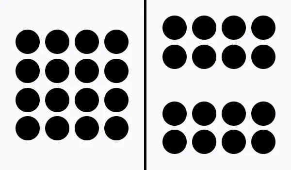
Continuation is the idea that we see shapes that are similar in color, pattern, form, etc. as all part of a single group, even if they overlap, bleed into each other, or are obscured in some other way. Some of the most iconic logos are built on this principle. For example, Amazon:

Common Fate is actually a principle of motion. Humans perceive a group of objects moving in the same direction at the same time as sharing a common motivating force — like a flock of birds moving together for the same reason. We can use this observation to create motion even in a static design.

Similarity is a principle of grouping that says that objects that are similar to each other in some obvious way will tend to get grouped together in people’s perception. This principle is also at work in the common fate example above as the color and shape of the fish strongly suggests to most observers that these fish are all part of one unit. And of course, because we perceive them as all part of the same group, it’s easier to use the law of common fate to create a sense of motion. Understanding that people group like objects together can also be a way for the designer to create a focal point by establishing a clear pattern of commonality and then breaking it.

The point of differentiation becomes the focus of the viewer’s attention.
Proximity is another principle of perceptual organization which states that objects that are near to each other will be seen as grouped with each other.
The Gestalt Principles are patterns of perceptual behavior can help the designer understand how people will react to different types of design choices. It informs the lines and shapes we place in a design and in what proximity to each other. A designer can exploit these principles to create designs that are interesting, unique, and draw a viewer’s attention to the right elements and most important information.
But there’s more to design than Gestalt. Once you know how design elements interact with each other, it’s also important to understand how they interact with space and how to use framing devices to control the audience’s attention.
Composition
Composition is about the relationship between the various elements in a design. There are several theories on how a good composition can or should be created, but the common thread running through every lesson on composition is the idea that it should create a strong point of focus.
The Rule of Thirds
The easiest way to deliberately create a focal point in an artistic composition is by employing an idea that aesthetic theorists simply call “The Rule of Thirds”, first defined by the painter and engraver John Thomas Smith in 1797.
In his book, Remarks on Rural Scenery, he wrote:
“Two distinct, equal lights, should never appear in the same picture : One should be principal, and the rest subordinate, both in dimension and degree: Unequal parts and gradations lead the attention easily from part to part, while parts of equal appearance hold it awkwardly suspended, as if unable to determine which of those parts is to be considered as the subordinate.”
Applying this rule is a simple way to achieve a clear focal point to the composition while maintaining balance from one side of the image to the other. As Smith noted above, framing a subject in the center can split the focus awkwardly, and framing a subject too far to one side or the other can wreck the balance of an image, leaving one side uncomfortably empty while the other will be compressed and claustrophobically close to the edge.
Most modern cameras provide framing guides that split the vertical and horizontal dimensions of the image into thirds to make shot composition easier.
Here are some excellent examples of effective use of 3rds:


On the other hand, here’s an example of an image that violates this rule awkwardly:

As you can see, there’s really no focal point in the last image at all except the standpipe running up the side of the wall. Somehow I doubt that an ugly pipe is what I’m supposed to be looking at here. This image brings us to another key concept of design:
Symmetry, and Asymmetry
Just like a lack of balance in any other aspect of life, an unbalanced image can seem lopsided and will feel off to the viewer. Achieving balance in an image is a matter of thinking holistically about all the elements in frame: the subject, texture, light, contrast, space, etc.
Too much on one side does create a focal point, but it means the rest of the image is wasted and awkwardly empty. Imagine how a room would look if you entered it and all the furniture was pushed over to one side, leaving a huge open space
However, seeking balance in a design does not mean that you should go for perfect symmetry. As you can see in the photograph of the two windows above, symmetry can lead to lack of clarity or focus and create a situation where the viewer’s eye bounces back and forth between one side or the other, never coming to rest on what’s important. Asymmetry can help you draw attention to the part of the image that’s most essential.
All that said, there are cases where you want to create a sense of awkwardness or discomfort in a viewer, and if that’s what you’re going for then perhaps symmetry is exactly what you want in an image.
Some of the most famous examples of symmetry in composition come from the filmmaker Wes Anderson (Royal Tennenbaums, The Aquatic Life of Steve Zizou, Moonrise Kingdom, etc.):

Anderson’s style is very specific, but one of the effects of his symmetrical composition is to create a tone that is deliberately unsettling. Dressing both sides of the set with similar props, and positioning the actors in the center of the frame is both in tense and a little discomforting.

You’ll also notice that symmetry isn’t the only special design choice Anderson makes. He’s also using color and light to create uniformity in his images, which only reinforces the symmetrical nature of his compositions. However, these choices make a lot of sense considering that his subjects are frequently dysfunctional families and people with lots of neuroticism.

I don’t want to oversell the analysis here, but it seems to me that his characters and his stories are nearly all extremely off-kilter — people searching for balance and clarity in their lives but who have none. To set those kinds of people into a world of perfect symmetry and rich, saturated clarity strikes me as highly intentional visual irony.
Either way, his style works to convey the message he’s actually trying to convey, and on that note I’d like to offer one of my only “rules” about design that supersedes all others:
Design is about communication. Effect. Violating a standard design principle is always ok if doing so communicates your intended message more effectively.
Space & Proximity
Another critical aspect of composition and framing is how the designer uses space. As we saw in the initial examples, it’s easy to clutter an image with design elements, or to crowd the edges of the frame in ways that feel unbalanced and uncomfortable for the viewer.
This is a tragic fact of graphic design for almost every small-time political campaign you’ve ever seen.

There are too many images, too many competing colors, too many words. Everything is squeezed together, nothing is legible or clear. Where’s the focal point? What’s the key takeaway? What one thing do you see when you look at this image? The only message that this design communicates to me is “lunatic”.
By contrast, look at Barack Obama’s ad design.

It’s clean, clear, and simple. Nothing is too crammed together, nor is anything pushed against the edges of the image. There’s one message: “Romney Economics” are bad, Obamanomics are good. There’s a clear call to action: Tell us your email and where you live, and we’ll remind you to vote. And lastly, there’s a heroic shot of the President looking into the middle-distance, reminding you that he has a strong vision for the future that you can rely on.
There are two ways of thinking about space. Positive (the elements that are in focus inside the image), and negative (the empty areas or even the out-of-focus background).
A lot of people think that if they’re trying to communicate through design, they need to fill the page with the message to make it overpowering. However, negative space is every bit as - if not even more - important when thinking about how to present your message. Negative space creates separation in an image, which allows the important elements to stand out.
Consider the poster for the movie La La Land:

This poster uses space (and contrasted color) to draw attention the most important elements: The title, and an image depicting a strong emotional beat between the lead characters.
Note the separation of elements here. There are three points that stand out, mainly as a result of the way they contrast with the deep purple/blue background. The text (the title), the yellow dress (the characters), and the lamp post (the setting). These three elements form a triangle, and they aren’t cluttered by any other elements around them. In other words, there’s a ton of negative space here.
Everything you need to know is crystal clear: This is a film that stars two A-List actors in a romantic fantasy story set in Los Angeles, and it’s called: “La La Land”.
Here’s another brilliant use of negative space:

The product floats in a sea of empty space. There’s nothing to distract from the core message, and nothing feels cluttered or squished.
On a personal note, negative space -- and the related issue of leaving sufficient edge margins -- is a big deal to me.
I may be particularly sensitive to this, but when an image is too cluttered or crowds the edge of the frame, most viewers will experience it as awkwardly, sometimes uncomfortably compressed. For me, the best word to describe the sensation is “claustrophobic”. This is a constant problem with terrible memes…
Like this:

Or… This:

The point is, good composition is not just an issue of where elements are place in the frame. It’s also about how much is going on, and being selective about what to include.
Now that we’ve discussed the Gestalt Principles, the Rule of Thirds and the importance of balancing Positive & Negative Space, we should talk about another idea of composition that predates all of those ideas and which has influenced design composition for thousands of years:
The Golden Ratio
Perhaps the best-established method of building a fantastic composition is through the application of of “fibonacci spirals”, otherwise known as “golden spirals”, derived from the Euclidean concept of the Golden Ratio (expressed as the irrational number Phi).
Mathematically, the ratio is 1:1.6180339… (usually rounded down to 1:1.618).
The relationship between two line segments is in the “golden ratio” when the ratio of the two segments is equal to the ratio between the larger of the two segments and the sum of both segments. In other words:
a+b: a :: a:b (see below):

To be honest, I’m neither competent to fully explain much about the math behind the concept, nor is it necessary for me to do so.
What matters is that we can create a rectangle using this ratio, then divide it at the golden mean (where “a” meets “b”), thus forming another rectangle. Since the ratio is an irrational number, we can replicate this process perfectly a theoretically infinite number of times, creating smaller rectangles.
Once we do this, we can connect all the points with a curved line, and that gives us a perfectly repeating natural spiral, which we call “Golden Spirals” or “Fibonacci Spirals” in honor of the 13th Century mathematician Fibonacci, also known as Leonardo of Pisa.

The fascinating part about all this is how often you see this kind of pattern in nature. Here are some examples:

Look around the natural world as you go about your daily life and you’ll start to see it everywhere. Almost anything that features a spiral growth pattern emerging from a central hub will fit into this pattern fairly closely — but (and this is pretty important!) usually not perfectly.
But please don’t get too caught up in this.
For centuries, people who have seen these patterns in nature (or who have imposed the pattern on nature, depending on your perspective) have further assumed that there is some kind of spiritual, or religious quality to the affect. This has spawned any number of nutty theories about the nature of god and the universe and the significance of the ratio itself. Some people believe that deciphering the mathematics of this kind of phenomenon will unlock magical secrets of the universe and give us power over the laws of physics.
I am not kidding.
However, I would point out that as human beings, we’re a part of nature and our species’ development has an evolutionary history that happened in parallel to the development of many other species of animals and plants.
As a result, we all perceive the world in a particular way and we have had hundreds of thousands of years seeing the same kinds of shapes in flowers, plants, weather, etc. Consequently, we’re all exceptionally familiar with these forms, and even if we don’t understand the terminology or the mathematics behind the ratio of the spirals we’re seeing, we’re intuitively and subconsciously aware of them as we go about observing the world as part of living our lives.
We’re also pattern-seeking creatures, and it’s incredibly cathartic for us to be able to recognize shapes and forms that remind us of flowers, clouds, and the curve of human faces, because those shapes are familiar and non-threatening.
From my vantage point, we can leave the mysticism at the door.
The Golden Spiral is a naturally occurring pattern that is attractive to people on those grounds, as well as being attractive intellectually because of the nature of the mathematics behind it.
And the math is actually important, because it shaped the history of design. In their quest for Platonic Ideals (including the Golden Ratio), many ancient Greek and Roman architects built buildings with this ratio embedded in their designs.
For example, the Parthenon:
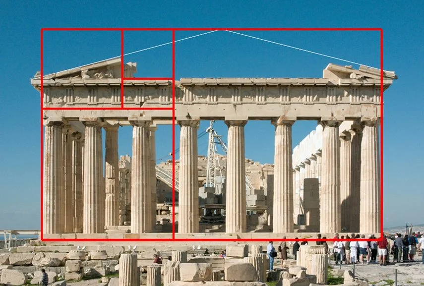
And since the ancient Greek designs formed the foundation for modern architecture, this trend has continued into the present day.
People observed an infinitely expandable pattern in nature, early mathematicians studied that pattern and discovered a fascinating intellectual aspects of it, and as a result architects and artists have been importing this concept into their work for thousands of years. That’s why photographers and cinematographers, painters, artists, and designers continue to use this ratio in their work as a guide to good composition.
Let’s look at some examples:

This is a great composition for many reasons. It uses light and contrast draws your eye to draw your eye to the woman’s face. The contrast of smooth skin to rough rock texture also helps establish focus. But as you can see the entire framing of the image itself fits almost perfectly into the Golden Ratio.
Here’s another example:

In this case, the photographer has used the secondary division to frame the foreground while the rest of the image is devoted to the majestic landscape.
Clearly the fit on this image isn’t quite perfect. Theoretically, if it was, the horizon line would be a little bit lower, and perhaps the canoe would be fit entirely inside the lower right rectangle. Don’t worry about this too much. These are all guides… rules of thumb. Neither the Golden Ratio nor the Rule of Thirds are magic bullets for great design nor are they ironclad laws.
They’re just ways to help guide your compositions and frame subjects in ways that that are attractive, natural, and clear.
This ratio is found throughout classical artworks. For instance, here’s Leonardo da Vinci’s “St. John the Baptist”:
![golden-spiral-st. john the baptist [da vinci].jpg](https://images.squarespace-cdn.com/content/v1/51808cdee4b051aa0c934840/1567387818852-JZCXCUJFQH086AYZ9MJ3/golden-spiral-st.+john+the+baptist+%5Bda+vinci%5D.jpg)
And here’s da Vinci’s “The Last Supper”:

Remember that we’ve all actually seen examples of this stuff in nature, architecture, fine art and photography for our entire lives, so it doesn’t actually need to be complicated. So most of this should come fairly naturally once you’re relatively attuned to it, but you do have to pay attention to composition whenever you’re engaging in design in any medium.
That said, the choices you make regarding the framing of an image, the position and shape of the elements in is hardly the only aspect of design that matters. There are several other major considerations that you should be aware of.
Texture & Patterns
I don’t actually have a lot to say about texture, except that there are a few things I tend to keep in mind whenever I’m considering introducing these elements.
1. Don’t Overpower The Design
Any additional texture or pattern is going to raise the level of complexity and detail to a design, and if the design is already very busy and filled with elements, this could be overwhelming to the eye. To that end, it’s important to know when to hold back and practice editorial restraint instead of throwing every element you can onto the canvas.
Subtle textures and partial opacity overlays can work well, enhancing visual interest and adding layers of depth to the artwork, especially when they complement the actual themes in the design. For example, if you look closely at the poster for the 2018 thriller, Dragged Across Concrete, the actual background of the image itself appears to be concrete.

On the other hand, really aggressive textures and patterns should be used sparingly and intentionally. To that end, remember that…
2. Avoid Clashing Patterns
The biggest risk I see in incorporating textures and patterns into your artwork is that it’s very easy to wind up creating a cacophony of competing imagery that will draw attention from the important elements and force the viewer’s eye to bounce around the page.
Consider this example from the Autumn Butterfly blog:

This is… Loud.
Apart from the models’ faces (which is actually a good thing), nothing about this image is clean or easy to track. If that’s the effect you want to create, by all means, go for it. But most of the time, flooding the image with different patterns is going to seem very tacky and distracting, and you risk losing the point of the design in all the clutter.
Typography
There’s a ton to learn about typography, and personally, I’m far from an expert. A lot of my advice in this section will mirror my advice everywhere else throughout this post, and if I could sum it up into a single sentence, it would be:
Restrain yourself!
Seriously… It’s insanely easy to ruin a great design with an over-abundance of fonts. We’ve seen this problem repeatedly in the bad examples presented in this essay already. Like everything else in design, clarity and purpose matter, so when you’re thinking about choosing fonts, I’d usually recommend restricting yourself to a maximum of 2—possibly 3—unique fonts total.
You’ll want something that can stand out as an effective header, a complementary font to use in the body text, and potentially another font for subheaders and accents.
That’s it.
We’ve all seen designs where every line is a new font, or where the creator uses garish novelty fonts to emphasize specific words—like having a dripping icicle font for the word “cold” or a 1980s throwback for the word “computer”.
Unless you’re mocking that kind of design or creating a video with that aesthetic, don’t do this.
Again, I implore you… Restrain yourself.
With all that in mind, there is some important nuts and bolts information and font & typeface terminology that I think is worth knowing.
Fortunately, there’s a great resource page from Material Design that goes into way more depth than I will here. One thing I will pull from that page is their graphic on typeface anatomy, as it will help orient the rest of the discussion.

There’s a lot there, but these are the attributes we normally need to think about the most:
Serif vs. Sans Serif (embellishments)
Stroke (line thickness)
Kerning & Leading (the horizontal spacing between letters and vertical space between lines)
Height of Capitals, Descenders, and Ascenders
Alas, I don’t have a lot of power on this blog to control in-line fonts, but I’ll offer some of my broad observations about font choices and try to supplement that with a few examples.
Serif vs. Sans Serif
Serifs are the little embellishments you see on the stems of different letters. You’ll note that the typeface I’m using here (Minion Pro) has serifs, where as the typeface on the headers (Futura PT and Good Headline) do not. This is fairly common. We’re used to seeing serifs on body text in part because they have been almost universally used in typesetting for printing presses and on typewriters forever.
Newspapers and magazines all historically used serif fonts, and when we started developing digital word processors, these styles remained.
Depending on the complexity of serif styles themselves, I think most of us also find them a little easier to read at smaller sizes than san serif fonts, perhaps because there’s more that is unique about each letter, so our brains identify the patterns more efficiently.
On the other hand, serif fonts aren’t very clean, and when you try to make them bigger and bolder, there’s a lot of extraneous elements that clutter up the design space—which is why I tend to prefer sans serif fonts for headers and major design focal points.
Stroke
The line thickness of any font is relative, but like anything else, the more area a font takes on the page, the more eye-catching it’s going to be—especially if it STANDS OUT against everything else.
That said, always keep in mind what you’re trying to say and what needs to be emphasized. Not everything needs to be bold, and the more sparingly you use heavy weight fonts, the more impact the ones you do use will actually have. What’s more, if everything on the page is written in a very thick, bold font, it will be much harder to read.
Also, keep in mind…
IF EVERYTHING IS HUGE YOUR AUDIENCE WILL FEEL LIKE THEY’RE BEING YELLED AT!!!
In every area of design, restraint and moderation are your friends. It’s the same in any art form… If you start out playing music as loud as you can, you’ve left yourself nowhere to go when you actually need to make a statement. Remember what’s important to the design, and reserve your boldest, most flashy fonts (and colors and everything else) for the focal points.
Leading & Kerning
This is something I think often gets overlooked, but you can usually control the letter spacing in programs like Illustrator, and that can make all the difference to the message you’re trying to convey.
Some fonts are inherently spaced a little loosely and far apart, others are much more squished together. And going back to those Gestalt principles, it’s easy to see why objects that are in tight proximity will make the viewer feel like the design itself is smooshed. If you want to create a claustrophobic feeling, then cool. If you don’t, then expand that space a little bit….. But not too much!
Too much s p a c e b e t w e e n l e t t e r s makes it impossible to see the words as independent units, and that’ll make it very hard for your audience to understand what you’re trying to convey. As I said earlier, our brains tend to find patterns and shortcuts in what we’re seeing to speed up comprehension. We see groupings of letters, mostly focusing on the first few in a sequence, and make heuristic-based assumptions about the rest. That’s why we can read stuff like this:
This is bcuseae the huamn mnid deos not raed ervey lteter by istlef, but the word as a wlohe
But if the letters in words and phrases don’t actually seem like they fit in proximity to one another, those groupings will be broken. So be careful with that.
Cap Height
Lastly, I want to talk about the height of capital letters, ascenders and descenders. I find that these are some of the most interesting ways that font designers create unique lettering. For example, I often love the extreme choices that Art Deco fonts display.

Some fonts, like Upper East Side or Fashion Victim above, have massive cap height, and the distance between the top of the capital letters and lower-case is extreme. On the other hand, you have stuff like Betty Noir and Chapleau where the capitals and (all-caps) lower-case are barely any different.
These are the kinds of factors that really play into the differences between fonts, and taking some time to think about how that’s going to look in the context of your design is always going to be worth it.
Trends
The last thing I want to say about font choice in general is that like most things in design, there are constantly evolving trends and fonts that are going in and out of fashion.
Fifteen years ago, Helvetica was the coolest font on the planet. They even made a documentary about it.
Today, while I still like it, a ton of designers I know find it boring and stale. That’s just the nature of the beast. But if anything, what the last few decades have taught me is that fads come and go, fashion is often cyclical (we’re tragically reliving the 1990s right now), and yet there are always ways to create timeless aesthetics that will never really go out of style.
Personally, I tend to steer my team towards choices that I think are going to be able to withstand changing fads and endure for a while, but there’s also really nothing wrong with deliberately creating designs that are fashionable knowing that they may make a splash today but become dated over time.
Design what you love.
Color Theory
Obviously, color is tremendously important to design. Color Theory provides guidance on how to understand, use, and mix color in design. Using color effectively begins with understanding how color is formed in relationship to the design medium.
Color Systems
Before we get to the nature of using color, it’s important to understand that there are two primary color systems -- additive and subtractive. These terms refer to adding or subtracting light.
As the name implies, in an additive system, color is generated by emanating light (ie. from a television screen) and mixing the colors as it is generated. This usually refers to the “RGB” system as you would find in video production, no red, green, or blue light emitted is pure black and full brightness for each value is pure white.
By contrast, a subtractive system such as RYB (Red, Yellow, Blue), and CMYK (Cyan, Magenta, Yellow, Key) are based on reflecting light and is suited for print media. If you’ve ever mixed a bunch of paints together, you know what happens: No pigment at all means all the light is reflected, which results in a white image. The more pigment is added, the less light is reflected and the colors become darker and darker until eventually everything just turns into a deep brown.
The “Key” is the black pigment that is added to the printing process to take the color so dark that no light is reflected at all -- ie. pure black.
As a designer, you should understand the difference because the color systems ultimately render color differently and will be presented in totally different ways. As a basic rule of thumb, RGB = digital & video, CMYK = print.
Also, regardless of the color system, there are three terms you should know that describe the specific details of any color:
Hue: The specific color chosen from the color spectrum
Saturation: The richness of the hue on a scale of 0% (faded/white) to 100% (ful hue)
Brightness: The brightness of the hue on a scale of 0% (black) to 100% (full hue)
Manipulating these three factors can produce an endless number of color combinations, and they’re the main tools designers use to get the color they’re looking for.
With that in mind, let’s talk about…
The Color Wheel
The relationship between different colors plays an enormous role in how to make color choices as a designer, and color wheels help make it easy to see how colors are related. Everyone has seen before:

So… How do you use this to make better design decisions?
First, note that each gradient of color is a product of color mixing, beginning with the three primary colors, Red, Yellow, and Blue, then extending into the three secondary colors, Orange, Green, and Purple. Because light exists on a spectrum, the color gradations are effectively infinite. We can always find a new color in between two existing options in the palette.
Generally, when we think about using colors in design, we think of using the wheel to pair colors in different ways to create “color harmonies”:
Monochromatic: All shades of one color.
Complementary: Colors opposite each other on the color wheel -- blue and orange; yellow and violet; red and green, etc. This is pure color contrast.
Split-Complementary: A variant on the complementary scheme where a primary color is chosen and paired with the two colors directly on the opposite side of the wheel.
Analogous: Colors that are adjacent to each other on the wheel -- violet and violet-red, red and red-orange; blue and blue-violet; etc. This is a way to build a color palette of extremely similar colors.
Triadic: Three colors positioned 120-degrees from each other on the wheel -- Red, Yellow, and Blue; Green, Orange, and Violet, etc. This approach is like a balance between complementary and analogous, providing a more moderate contrast between three colors that work well together.
There are other schemes like tetradic and square systems, but let’s look at some of these approaches in practice, as they might be used in interior design, starting with complementary:


Now let’s look at an analogous palette:

And finally, here’s a triadic approach:

All three approaches can work extremely well, and as you can see the colors in each case don’t clash or feel abrasive or tacky.
And remember, no color needs to be presented in its brightest, most saturated form. For most design applications, bright colors - especially the primaries - can seem childish. Fortunately, each color system has an entire gamut (range of colors) to play with, and every color can be brightened or desaturated to create a palette that works for your brand and doesn’t remind your intended audience of a circus tent.


As you can see, there are many color possibilities even with a limited range of hues, just by playing with saturation and brightness.
That said, please consider that if you’re going to pick a palette of colors, it often makes sense to be consistent about the level of saturation for each — meaning, if you decide to build a complementary palette around a blue with 50% saturation, then the orange you pair it with should also be around 50% saturation. Otherwise you’ll end up with a faded, muted blue and a bright aggressive orange, and that’s probably bad unless you want the orange to completely dominate the viewer’s attention.
And that really brings me to a few...
Final Thoughts
I’ve come back to this again and again throughout this post, but good design is all about effectively communicating ideas to an audience through the process of controlling their attention.
So… Focus on the Message
Anything that’s a part of your design that distracts from or otherwise fails to serve the message you’re trying to communicate should be cut.
I’m absolutely serious about this.
The lesson I’ve learned time and time again in every creative medium in which I’ve developed any proficiency at all -- from music, to writing, to photography & video, to sculpture, to drawing & design -- is that the best work is the work that is pared down to its most essential elements.
Thoughtful editing of creative work is a process which requires the artist to ask this one question over and over:
Why did you make the choice you made?
Why is this element on the page? Why this word instead of that word? Why did you put that object here? Why did you pick this texture? Why this color instead of that color? Why is there a line here and not there? Why are you drawing the viewer’s attention to this part of the design instead of that part?
Why, why, why?
And once you’ve asked these questions about yourself and the work you’ve produced, you need to be honest with yourself about the answers.
If the answer to any of those questions reveals either that A) you have no idea why you made a choice; or worse, B) your choice directly conflicts with the message you’re trying to convey, you probably need to make a change.
Be ruthless about this. Even if you like an element or think it’s cool, trendy, or allows you to flex a creative muscle you’ve been neglecting, if it doesn’t serve the point you’re trying to make it will only make your design worse. So… Get it out of there!
And lastly… To quote architect Mies van der Rohe:
God is in the Details
All of the things we’ve been talking about throughout this entire section are meaningless if you can’t be bothered to put in the time and attention to be meticulous. In the end, everything that separates good creative work from garbage is the quality of the execution.
Coming up with a decent idea is really the easy part. Being focused and careful enough to spot when a color is just a shade off or when a line is even just one or two pixels out of place is what’s necessary to take that idea and turn it into something effective.
Think about it this way: If you couldn’t find it in yourself to spend any significant effort paying attention to the details of your own work, what makes you think an audience will want to spend any significant time looking at it or taking in the message you’re trying to convey.
So put in the work.
And continue to put in the work until your design has gone live on the website or been sent to the printer.