The Art & Science of Building Strong Creative Teams
I’m proud to say that the last few years have been extremely transformative for the Foundation for Economic Education. As Director of Media, I’ve taken it from an organization with no professional media capabilities at all to a leader in creative design and multimedia production.
What follows are some of the strategies I've used to find success directing and motivating my team, and it all start with…
Clarifying Your Vision
We have had to intentionally produce conditions where creative people can get into their most open and imaginative states of mind as quickly as possible, and where they have the time and tools they need to solve creative problems effectively.
I believe that there are three essential components to doing this well:
Radical clarity of the creative vision and desired audience;
Flexible working structures that allow individuals to quickly and consistently tap into their most open and imaginative mental states;
Competent, collaborative, and honest feedback that helps shape unconstrained creativity into excellent and practically viable final products
The importance of being able to clearly articulate your creative vision cannot be overstated.
Without knowing what you’re trying to say, who you’re saying it to, and why it matters, you’ll have no hope of conveying the kinds of information your creative collaborators need to do their jobs effectively.
This does not mean that you should know what the end result will look like in advance—if you already knew that, then there would be no point in hiring specialized creative professionals in the first place.
What it does mean is that you should work to identify the specific problem you’re trying to solve by producing a piece of creative media and how to communicate your needs to the people who will ultimately be responsible for imagining and executing the solution to that problem.
It also means that you need to invest the time and effort to understand what you want to accomplish before you begin working on the final product.
There will be plenty of room to experiment and play with different approaches throughout the development and feedback process, but the one thing that should ideally never change is the goal of the project itself. If you begin a project by telling your designer or video producer that you’re trying to reach high school students in Dallas, TX with a message about how entrepreneurship is a path to personal fulfillment, the ideas they come up with are probably not going be useful if you suddenly change to a goal of talking to college students in Chicago about occupational licensing.
A set of creative goals that’s constantly shifting is like quicksand under the artists’ feet. Nothing will sink a project faster.
But the question remains: Once we have a clear understanding of the problem we wish to solve and the basic vision for the project, how do we decide what to create in a world of endless possibilities?
The Seven Criteria of Project Selection
Deciding which creative projects to attempt is an incredibly difficult job, both as an artist and as any kind of executive producer or creative director.
We live in a world of infinite creative ideas but painfully finite resources. Each of us has a limited set of resources and skills, goals and values, and most importantly a limited amount of time with which to create, so it will never be possible to pursue every idea we have, no matter how good it seems on the surface.
In my estimation, there are no fewer than 7 specific criteria that must all align before a project makes sense, and each of these is variable and carries different weight on the decision.
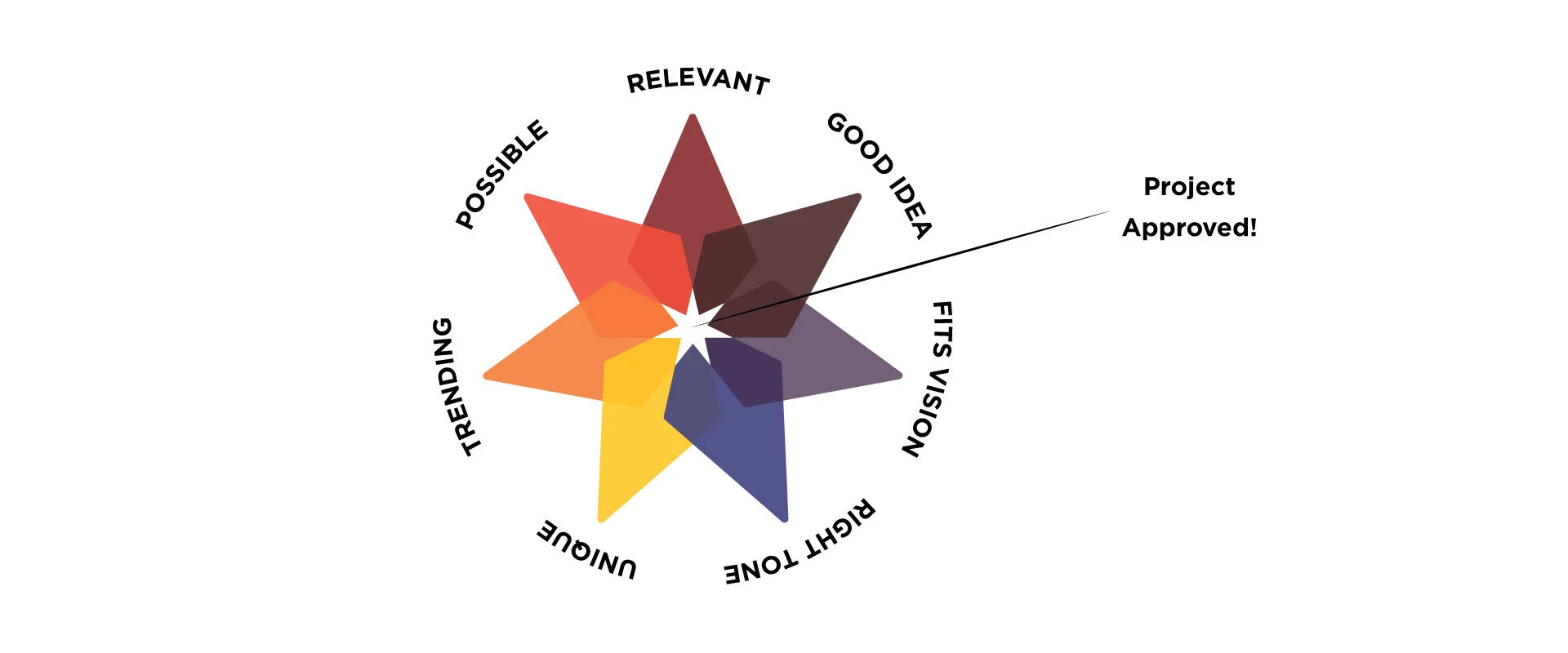
First, as obvious as it might seem, we must start with a genuinely (1) Good Idea that can translate well to the chosen medium (video, audio, design, etc.).
Ideas are easy to come by, but frequently (especially in the nonprofit world), they aren’t workable, interesting, or compelling. Over the past 15+ years that I've been producing original creative content, I've generated and/or been pitched several hundred different concepts, but very few of those were actually good for the intended medium.
Visual (and auditory) storytelling is different than writing an article, a white paper, or a book, and writing for video or designing artwork for digital or print distribution are special skills that take thinking beyond abstract concepts or dialogue, so finding an idea that actually makes sense for the medium is not easy—especially in an environment dominated by left-brained, systemizing thinkers such as economists, philosophers, and political scientists.
But beyond merely having a Good Idea, these ideas must (2) Fit Brand’s Vision, and they must (3) Fit Brand’s Tone.
For example, FEE is a 72-year-old institution with the crucial mission of advancing a free society, so producing any good idea still isn't enough. It must be an idea that actually advances our vision of a free society in some meaningful way.
In addition, because FEE is an organization that caters to parents, young students, and the general public; because it has donors to attract and keep; and because we have a long-standing legacy to uphold, we must also be very careful about the tone we present to our audiences.
The tone we want to cultivate at FEE is “optimistic, empowering, dynamic, morally principled, credible, and collaborative.”
This is can be a tough needle to thread when we also want to dominate social media. It’s no secret that much of the most shareable content online is pessimistic or angry, sarcastic, insulting, tribal, and deceptive. In general, if you can get someone to feel outraged or present them with content that provides a new reason to hate an enemy or pat themselves on the back, you’re probably going to get them to click on your content and possibly share it with their friends.
For example, there is no shortage of content like this on social media:

Note that in both of these cases, apart from simply being poorly designed and ugly to look at, the images are intended to pit one group of people against another and rely on creating a sense of outrage or anger to connect with its intended audiences. My view is that while this is quite often the easiest path to success online, it is also frequently unethical and probably damaging to society in general.
More importantly, from the standpoint of project selection at an organization like FEE, "good ideas" that are mean-spirited, inappropriate, fail to honor donor intent, which violate 501(c)3 rules, or fail to comply with the law in some other way simply must be rejected.
From there, once we have a Good Idea that Fits FEE's Vision and Tone, I begin asking questions about the idea as a matter of strategy. Is the idea (4) Relevant to an Audience that we're trying to reach? Is it actually (5) Likely to Succeed given all that we currently know about what's trending, what topics or styles are popular, and what kinds of stories people, in general, seem to respond to? Is it (6) Unique, both to FEE (ie. do we have overlapping projects happening simultaneously?) and to the market at large (ie. is someone else doing this already?) and thus unnecessary?
Last, but perhaps most importantly of all, we have to be realistic and ask whether this idea is actually (7) Possible to Execute.
Getting Realistic About What's Possible
Like many other organizations in our network, FEE has an incredibly small production team—just 3 full-time staff members and a number of independent editors and producers who work on specific projects.
This means that we have serious limitations both with regards to time and to overall capabilities.
We have an excellent team, but quality media production is still an incredibly difficult and complex process that requires a variety of skill sets from understanding and internalizing aesthetic ideas like story, design, composition, framing, rhythm/pacing, etc. to hard skills like using cameras, lights, editing & visual effects software, and other technology. We also have a budget significantly under those found in the broader media industry, and yet a core goal of the YEAR project requires us to be able to produce a wide variety and large quantity of content, so we need to make all of our resources go as far as we can.
Another, often underrated, aspect of assessing whether or not a project is truly "possible" is how passionate the creative team that will actually work on it is about the idea.
Our now award-winning documentary series, "How We Thrive" is successful partly because the director/producer team contracted to shoot and edit those films went into the project with a strong passion for telling stories about female entrepreneurs. That passion inspires them to work harder, pay closer attention to the fine details, and care enough to get every aspect of the film right.
It’s a similar story with my own video essay series.
“Out of Frame” has generated several million views on YouTube since it started, contributing significantly to our rapid growth in subscribers on that platform—from a virtually dead channel to over 100k in around a year and a half. But that would not have been possible if I wasn’t personally interested and invested in the style of the presentation, the content, and the ideas I’m writing about each month.
In fact, doing a monthly series that I did not enjoy working on would become a nearly unbearable chore and would not be remotely sustainable.

Regardless of their level of professionalism and talent, pairing a producer or a production team with a project they aren’t passionate about will not create the same results as pairing them with a project they care about, and that fact should play a major role in project selection.
Even when a project is technically possible, a lack of creative inspiration can be even more destructive than a low budget or tight schedule.
After taking into consideration all these criteria, we end up with a pretty narrow set of projects that are truly viable and a lot of projects that might seem like good ideas on the surface but are out of reach. There are a lot of tough choices that need to be made in that regard, based on our judgment of what's feasible.
These seven steps are essential to making effective production decisions and if well-understood can help organizations and individuals create their best possible creative work.
They’re also the basis for defining a radically clear creative vision, because that kind of clarity only comes with deeply understanding not only your audience, but also the goals of the project you’re trying to create and why such a project is actually the right fit for your organization.
Once your vision is clear, it’s time to figure out how to execute.
For that, we need to proactively build work environments that encourage openness and creativity so that our people are empowered to come up with their best ideas, and then we need to understand on how to use quality feedback to iterate better final products.
This begins with understanding the science of creativity.
The Psychology of Creativity and Shaping Innovative Working Environments
In cognitive psychology, the greatest predictor of creativity is the degree to which a person displays “open to experience”, which is one part of the five-factor model commonly used by psychological researchers to assess an individual’s personality traits.
According to Psychologist World:
“A person with a high level of openness to experience will often enjoy venturing beyond his or her comfort zone. They seek out new, unconventional and unfamiliar experiences, travelling to new destinations, embracing different cultures and practices.
Higher levels of openness can lead a person to be more open to novel or unconventional ideas and viewpoints. Such people are often more willing to try out new activities that they have not experienced previously.”
There are also multiple sub-traits for openness to experience and they make it fairly obvious why this trait is connected to creativity:
Active imagination (fantasy);
Aesthetic sensitivity;
Attentiveness to inner feelings;
Preference for variety/diversity;
Willingness to experiment;
Intellectual curiosity
As a personal example, I’ve taken five-factor model personality surveys numerous times over the past several years, and I consistently score at the highest levels of trait openness, as you can see from the image below:

But simply because someone is naturally predisposed to openness doesn’t mean that they are going to be able to be creative on command, or that they can be creative all the time.
In fact, it’s impossible to be permanently engaged in uninhibited, open thinking because doing so directly conflicts with analytical reasoning, task-based mental operation.
Modern neuroscience research has shown that our brains actually operate with two competing systems that play an important role in creativity, imagination, and execution.
One system, called the Default-Mode Network, is often understood as a state of “mind wandering”, and is operating when we’re engaged in unconscious tasks and emotional states such as daydreaming or empathizing with other people. The other system is called the Task-Positive Network, and is an analytical mode used in performing specific tasks requiring focused attention and higher order (logical) reasoning.
The important thing to understand is that while we all use both systems all the time, we can’t use both at the same time. This has a lot of really significant implications for anyone who wants to build an environment that encourages and nurtures creativity.
In a 1991 presentation for Video Arts and in a related talk at the Creative World Forum nearly 20 years later in 2009, Monty Python writer/performer John Cleese referred to these systems as the “open” and “closed” modes.
In the open, or more creative mode, we are thinking playfully and using our imagination - that is, we're exploring all of the different types of ideas that may come out of our minds without too much consideration for practicality, factual accuracy, or whether or not they're logically sound. We’re thinking in unconstrained, uninhibited terms.
By contrast, in the closed mode, we are thinking practically, rationally, and critically. We’re analyzing our ideas and actions, deconstructing the fruits of our previous creativity -- reining in our most fanciful ideas in order to make them attainable in the real world. We’re deliberate and constrained in our thinking, and we need to be in order to execute the task we’re trying to accomplish.
Cleese clarifies the value of each mode as such:
"We need to be in the open mode when pondering a problem — but! — once we come up with a solution, we must then switch to the closed mode to implement it. Because once we’ve made a decision, we are efficient only if we go through with it decisively, undistracted by doubts about its correctness."
Both modes are necessary for innovation. However, Cleese goes on to point out a common problem most of us deal with as we become adults and adopt more responsibility in life:
"To be at our most efficient, we need to be able to switch backwards and forward between the two modes. But—here’s the problem—we too often get stuck in the closed mode. Under the pressures which are all too familiar to us, we tend to maintain tunnel vision at times when we really need to step back and contemplate the wider view.”
Even people who are professionals working in creative industries are frequently at the mercy of these pressures and the resulting competition between neurological systems. There’s always another email to write, another coworker or client to speak to, the next meeting to schedule, more supplies to order...
There’s always some new task to execute and those tasks can always serve as a distraction that prevents the mind from becoming unfocused and playful long enough to enter the open mode.
So the question is: How do we create a work environment that allows our people to break free from those kinds of pressures and become their most creative selves as often and for as long as possible -- without sacrificing productivity?
The “Creative Oasis”
John Cleese’s solution to the problem of getting stuck in the closed mode is to intentionally build what he calls a “creative oasis”.
The idea is to create a hard separation from task-based distractions, calm the mind, and allow the Default-Mode Network (“open mode thinking”) to take control. To do this, Cleese recommends deliberately establishing five specific conditions:
Space: “You can’t become playful, and therefore creative, if you’re under your usual pressures.”
Time: “It’s not enough to create space; you have to create your space for a specific period of time.”
[Note: Cleese recommends blocking off uninterrupted creative time in hour and a half bursts, as it is neither so short that you have no time to get anything done once you’ve gotten into the open mode, nor is it so long that you eventually run out of energy and get frustrated. However, I personally prefer longer periods of 2-3 hours.]Time: “[Give] your mind as long as possible to come up with something original.”
[Note: This is very important, and we’ll get back to it in a moment as it has huge effect on managing and working with creative teams.]Confidence: “Nothing will stop you being creative so effectively as the fear of making a mistake.”
Humor: “The main evolutionary significance of humor is that it gets us from the closed mode to the open mode quicker than anything else.”
I’ve found the “creative oasis” to be extremely valuable over the years, and most successful artists I know employ some variant of this concept. However, we must also recognize that every person’s ideal “oasis” is going to be a bit different, and may even change over time.
Some people prefer to write, draw, design, or edit in coffee shops and other crowded public spaces. Others prefer total isolation. Some people play music in the background while they work, others prefer silence. Some people feel most creative in the morning, others late at night. Some people prefer to work from home, others find home to be a distraction and need a separate office.
FEE’s Sr. Graphic Design Associate, Tim Webster described his ideal creative oasis as follows:
“Music is important, especially just instrumental music. A lot of times I need to have something more tangible like a sketchbook to get ideas out. I also need to be alone. Going for a run or a drive sometimes helps me meditate on an idea.”
On the other hand, while I do prefer to be alone, I can’t listen to music while doing most kinds of creative work.
My background as a musician with almost 8 years of collegiate and graduate musical education and years of performing and composing experience makes it nearly impossible for me not to be completely distracted by whatever I’m listening to. We’re all different.
From the standpoint of developing high quality creative teams, what this diversity of preferences means is that organizations and managers should strive to maintain a high degree of flexibility in how we think about scheduling and working environments. In order to get the best results, it’s important to make sure the individual members of our teams have a significant amount of unstructured time and that we empower them to work in the spaces most comfortable to them.
We want our people to be free to create their own oasis so that they will relax, loosen up, enter the Default-Mode Network state and generate more and more original ideas.
The Special Importance of Time (and Setting Reasonable Deadlines)
You’ll note also that John Cleese’s “Creative Oasis” uses the word “time” twice.
He stresses the importance of this redundancy and I strongly agree. It’s not enough to set aside a few hours in a given day for the sole purpose of pondering a creative problem without interruption. People also need time to ruminate on these kinds of problems over the course of days or weeks, because a lot of the best solutions are simply not going to come to us right away.
Writers and artists will often complain about the tyranny of the blank page. They will lament having to stare at a white canvas with nothing on it for days at a time before inspiration strikes. But the truth is that the period of apparent inactivity before the spark of creativity sets in is usually crucial to the process as well. During that time, we are mulling over possibilities, thinking about different approaches to a problem and allowing our conscious and subconscious minds to grind away until a satisfying solution presents itself.
This is why it’s also of the utmost importance to ensure that the creative projects we assign our teams have sufficiently distant deadlines.
We need to give the people working on those projects as much time as possible to solve the various problems that need to be solved and come up with their best ideas -- as opposed to simply accepting the first solutions that come to mind.
Unfortunately, due to unrealistic deadline constraints or simply someone’s unwillingness to tolerate the discomfort of leaving a problem unsolved, most people give up before they’ve really honed their ideas and end up producing half-baked products as a result.
In my view, this is a really important yet frequently-ignored insight for both creative professionals and their clients/managers:
It is almost never the case that the first idea anyone comes up with is their best idea, and yet the discomfort of unsolved problems and external pressure to create on command makes it very easy for people to accept the easiest, most obvious solution and move on too quickly. However, being able to tolerate that discomfort and ponder a problem longer often separates the mediocre final product from the superior work of art. We’ll talk about a specific, recent creative project at FEE later on that will serve as an excellent example of this point.
It’s exceptionally valuable to provide your artists lots of time to sit with the problem/project vision and really dig into an array of possible solutions before pushing them to settle on one.
The only way to do this effectively is by doing our absolute best to make sure we have realistic deadlines and plan our schedules with sufficient ideation time in mind. Springing projects on people at the last minute is a good way to get frustrated team members and less-creative, poorer quality results.
The Role of (Valuable) Feedback
Once we’ve established and communicated a clear vision and given our creative team the freedom and flexibility to work at the problem from different angles until they’ve developed their most innovative and original ideas, we will eventually need to turn those ideas into a high quality final product.
This is where competent analytical feedback comes in.
The ideas that flow from the creative oasis may be very good in the abstract, but they’re also usually unconstrained by practicality—cost, brand-alignment, technical difficulty, etc.—in order to turn those ideas into something that actually accomplishes the vision.
The feedback process generally starts with the artist him/herself simply stepping back, re-entering the “closed mode”, and rationally assessing their own work—checking for errors, analyzing it, criticizing it as objectively as possible.
But critiquing one’s own work is difficult and other voices should almost always be part of the process as well. However, not every voice is equal[1] and we should not shy away from this fact. Ideally, the people delivering feedback on new art will mainly be people who have done a lot of the same kinds of creative work that they are judging and commenting upon. Technical expertise, meaningful experience, and a keen eye are essential to this process.
This is important.
Practical experience actually producing creative work (graphic design, writing, editing, etc.) gives people a lot of valuable insights about the process that lay-people cannot fully understand. Without personal technical competence, reviewers won’t really know what to look for or how to assess work at different states of completion and are far less likely to provide insightful suggestions.
To that end, a mistake I think a lot of organizations make is assuming that anyone can be put in a position of giving creative feedback and managing creative teams. In my experience, this isn’t true.
If no one with a high degree of technical expertise is available internally to fill these roles, spend time building an external network of competent professionals to review creative work. Do not rely on inexperienced voices alone.
Equally important to this process is honesty. Feedback that isn’t direct and honest is nearly useless.
That said, honest feedback, particularly when critical, can be painful to give and to accept.
There are a lot of things we all can do as individuals to become better at taking critical feedback on our work, but it’s also possible to create an atmosphere where honest feedback is not only expected, but actually appreciated simply by observing a few basic rules.
It’s about the art, not the artist. People are less likely to take criticism personally if it is, in fact, not personal.
Make it meaningful. Both overpraising trivial wins and excessive nitpicking will render our feedback meaningless over time. It desensitizes people to important criticisms and cheapens the value of drawing attention to genuine success. Focus on the big picture and reserve your comments for important details that are both working and not working while keeping in mind that different types of feedback is necessary at different stages of production (ie. criticism of fine detail is often obnoxious in the context of a first draft but essential by the final draft).
Keep coming back to the vision. The point of feedback is to move forward with each iteration, and that requires constantly bringing the discussion back to the essential question of which aspects actually serve the intended goals of the project, and which detract from those goals. What are we trying to say? Who are we trying to speak to? How do we get our art to say what we want it to say as effectively as possible? If our feedback doesn’t address that core question, we’re wasting our time.
Praise enthusiastically, criticize dispassionately. Most constructive feedback will naturally include both the aspects of a creative work that need improvement, and also the aspects that are on the right track. Critical analysis should be almost clinical in its nature, reinforcing the point that it is impersonal and solely about improving the quality of the art. However, when it is time to praise, we should do so with sincerity and enthusiasm. This will not only help people feel valued, it will also help them understand what specific direction their revisions should aim for, as opposed to merely knowing what not to do again. If all we do is tell people what’s not working, that still leaves them guessing as to what would be better among a near-infinite field of possibilities.
“Yes, and…” The best feedback is a collaboration between people who value each other’s contributions, working together to make the product better over time. This process isn’t about one-upping the other person or imposing one person’s ego-driven ideas over another. It’s about incorporating the best ideas. Creative feedback seems to be at its best when it illuminates problems and offers pathways to a solution with humility. That way the collaborators feel free to build on each other’s ideas instead of cutting the creative process short and accepting the first one that sounds good or - worse - feeling pushed into accepting a lesser idea because it’s come from someone with more authority[2].
Good feedback can make a huge difference in turning a decent concept or rough draft into an excellent final product. Especially when coupled with a clear vision and an environment built to encourage openness and imagination.
One creative project at FEE perfectly illustrates the way these conditions work together and I'll share that with you in the next section.
Notes:
[1] The point that “not all voices are equal” is not meant to imply that other kinds of feedback are not useful. To the contrary, presenting creative works to lay-people can be very helpful -- especially at the very beginning and towards the end of the development process.
Their feedback can help us get a sense of whether or not the product will actually effectively appeal to the intended audience. It can also reveal issues with a creative work that the the designer or producer had not considered, such as how it might be received by donors or institutional partners.
However, lay-person feedback is often counterproductive where the goal is to hone in on fine details and make specific suggestions. Too many voices too early in the process will almost certainly do more harm than good, and the wrong voices later in the process will often lead to poor quality final products.
[2] Workplace dynamics and the hierarchy of status will sometimes necessitate going above and beyond to communicate that the feedback process should be collaborative and that just because a higher-authority person has an idea doesn’t mean that it’s necessarily the best idea.
Since the goal is to capture and incorporate the best ideas, we need to make sure everyone involved knows that the goal is truly about product improvement, not just ego-stroking. One way to do this is by asking questions with softer language such as “What if we did…?”, as opposed to saying “Make this change.”
The last thing we want is for people to feel like they can’t push back or offer a different solution to a creative problem because they’re afraid of upsetting “the boss”.
A Case Study: FEE Values Art
In this series on building strong creative teams, we've looked at the psychology of shaping innovative work environments and the importance of a clear vision.
I hope the last two articles have helped spark ideas for your own work teams and that they've been especially helpful as you look to ways of teaching the lessons of liberty to tomorrow's leaders. In this final installment, I'd love to share a process we recently worked through to unveil a new piece of art in our office that depicts our organizational values.
Below is the final product:

This project was a true collaboration between myself and FEE’s Sr. Graphic Design Associate, Tim Webster. And because most of our conversations took place via Slack, we have a detailed record of each successive iteration from the beginning, which makes it an excellent case-study in bringing together all of the elements I’ve discussed throughout this paper.
Phase 01: Establishing the vision and creative direction
The impetus for this project was simple. Late last year, FEE’s senior staff codified a set of six guiding principles for our organization. Our Executive Vice President Richard Lorenc wanted to commemorate these values with new art that would live on one of our walls.
These kinds of requests are always exciting because they clearly establish the problem that needs to be solved, but still leave a ton of room for original ideas. After a brief conversation, we settled on a large piece of wall-art and I proposed a direction for the design that (1) used continuous panels to tell a generally sequential story of our values; and which was (2) ultimately printed using a process called "dye sublimation," which prints a bold, vibrant, colorful image on metal surfaces.
I also provided some references for what that could look like from photographer Peter Lik and a TED Education presentation:


Note here that while this was all a fairly brief exchange, taking place over the course of only about 15 minutes, the three of us were able to cover quite a bit of ground in defining what would eventually become the final design.
For example, we agreed on the following:
What needed to be created: Permanent wall art at FEE’s offices
Intended audience: FEE’s staff & visitors
Required elements/information to be conveyed through the design: FEE’s six organizational value
Medium: Dye-sublimated metal; and…
Artistic Aesthetic: “Bold”, high contrast, minimalist illustration using silhouetted figures that incorporate some kind of “hero’s journey” into the overall design.
Clarifying these factors constitutes a fairly strong creative vision, and a sufficiently specific artistic direction.
But at the same time, I’d especially like to draw attention to the use of language such as “I can definitely use that for inspiration”, and “Unless we don’t do the metal printing process”. These phrases indicate that both Tim and I left the initial meeting with a strong sense of what needed to be created while still leaving a lot of room for us to continue developing the overall idea and possibly changing aspects of our plans down the road if we had better ideas once we had more time to think about it.
This is an important attitude to maintain, especially so early in the creative process.
Very little at the beginning stages should feel (to the artist or the client) like it’s completely set in stone, or it will stifle the flow of good ideas. Remember that our best and most fully formed ideas are rarely our first ones, so leaving the design open to a range of future possibilities and making sure that we don’t prematurely commit ourselves to one aesthetic direction prevents us from locking in an idea too soon -- before we’ve all really had a chance to let it steep and get into our subconscious.
We want this phase of the process to give guidance and clarity, but also empower the artist (in this case, Tim) to ruminate, play, and experiment with different rough concepts until one rises to the top.
Phase 02: Test Illustrations and Solidifying the Direction
A little over week after the first discussion, Tim presented this image:

An enormous benefit of working with more experienced professionals is that while any lay-person can see that this is a fully-formed, well-executed illustration, it still constitutes part of the experimental testing phase of the creative process for a designer like Tim.
This is effectively one step above a basic sketch, made presentable enough to show for the purposes of review.
Tim explains his intention for the first draft:
At this stage in the process, I was thinking about how I could create a design system for each of the values, so that we could incorporate the illustrations in other ways. For instance, if each value had a corresponding icon/symbol, we'd be able to use them as badges for awards, or even in our brand guidelines. The illustration at this point was simply expanding on those symbols. The problem with this approach was that I wasn’t able to form a cohesive narrative and the imagery wasn’t strong enough on its own.
It’s also worth noting that the way Tim framed the design was very explicitly not as a final product in any way, but rather as just one possible direction we could go.
Tim: I’ve started on the designs for FEE values. They still need a lot of work.
The point of this draft was mostly just to quickly escape the tyranny of the blank page so that we could both start talking about a more concrete concept and align our independent visions into one idea.
And since we both understood that, it was very easy for us to discuss the work in more critical terms.
My initial reaction was mixed:
Sean: My gut right now on these designs is that while I like them, they’re not quite what we talked about, ya know? They certainly wouldn’t have the bold contrast that we’d need if we were to do the metal printing.
Tim: Okay, I see what you mean. This started out as a wire frame just to get the basic outlines down, but then I got carried away with color. If I were to fix the colors and the contrast, would these concepts still work or should I revisit the drawings too?
Sean: Personally, I like them, and I’m happy to see where you go with it, but when we talked before it was more minimalist, like… there’d just be shapes. Let me ask you this… Richard’s goal was something really bold and eye-catching. So that, for me, really is about contrast more than it is about illustration style. So do you think that you can take these characters and re-work the backgrounds/settings to put huge highlights on them?
Tim: Yes, definitely. I have more thoughts on it that we can talk about later though.
Sean: Sure.
Once again, this round of feedback was very brief, but worthwhile. The basic tone and nature of the feedback encouraged Tim to think more about the design, and rather than totally shutting down the parts I mainly highlighted the problems of lack of boldness and contrast and asked for options on how to fix those issues.
Here's Tim’s perspective on this process:
I think presenting a problem and then asking questions is one of the best ways to give feedback to a designer. It allows us to explore a lot of ideas and then pick the best one, without locking us down to specific concepts. Suggestions are helpful too, but I've found that the exploration phase usually leads to the smartest solutions..
I agree.
This question-based approach is one I use a lot and it goes back to the idea of creating an environment where we try to bring the best ideas to the top by trying to facilitate a more collaborative environment.
Remember that Tim is not only closer to the design, having been the one to create it, he’s also the one of us who is dedicating serious time to thinking about it. I may be able to see some issues he can’t, but I’m not going to be the one spending the next several hours working on the next iteration, so even if I have a suggestion that I think is a good idea, I don’t want to presume that it’s the only solution or necessarily even the best solution. More time and experimentation will almost always pay off.
To that end, Tim and I did not speak about the project again for another two weeks, when he presented me with a new design:

Here we have a version that seems to be much simpler than the previous draft. With its sketch-like aesthetic, lack of color, and minimal detail, I’m sure that to the layperson, this could look like a step backward.
But in reality, this version is a major leap forward.
Simplicity of the artwork aside, it’s a far more cohesive concept which now showcases the hero’s journey aspect that Tim and I had discussed and it connects all six values together into a single image.
As surprising as this might be, I see this version as being very close to the final product.
At this point all the basic elements we ended up with are now on the page and the next several changes are successive, iterative, and more subtle - yet they're all extremely important.
Let's look at the next stage of these revision notes:
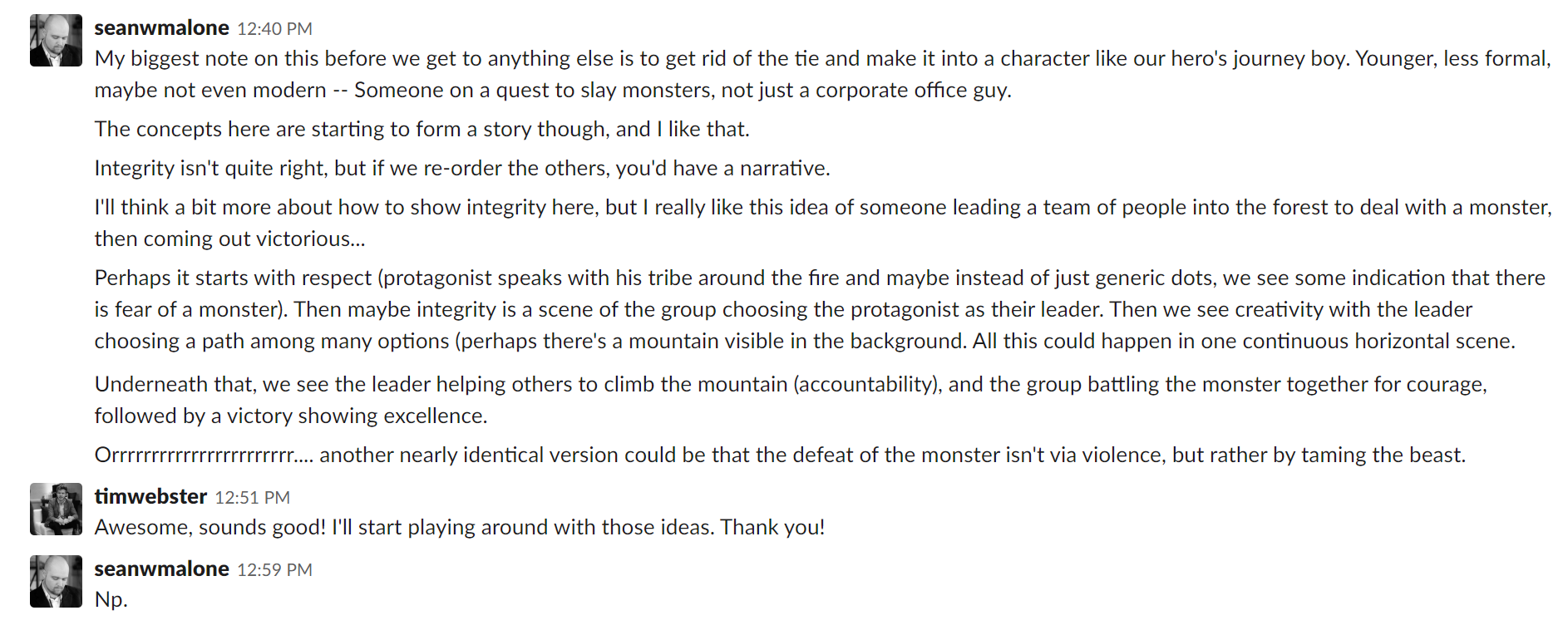
’ll transcribe the above so that I can also break down the thinking behind my various notes:
Sean: My biggest note on this before we get to anything else is to get rid of the tie and make it into a character like our hero’s journey boy [editor’s note: this is a design already on one of FEE’s office walls, taken from a cover illustration for the Freeman Magazine]. Younger, less formal, maybe not even modern -- Someone on a quest to slay monsters, not just a corporate office guy. The concepts here are starting to form a story though, and I like that.
My reason for suggesting that we get away from modern-looking people wearing office attire is that the intended audience are FEE staffers who (1) mostly do not wear suits and ties; and (2) perform what we all believe to be incredibly meaningful work that I certainly believe is heroic.
Tapping into heroic archetypes instead of the staid and dare-I-say boring modern workplace imagery seemed like a much better way to get our staff to identify with the values on a personal level.
In addition, a heroic fantasy setting is much more whimsical and fun, which I tend to think is important given that the goal is to inspire people. We also have similar imagery on another wall of our office, near the final placement of this artwork.
This change marks one of the final major shifts in direction for the design.
From here on out, we start really building on the existing elements and making what’s already there better -- starting with the narrative structure itself so that the images actually tell a more coherent story:
Sean: Integrity isn’t quite right, but if we re-order the others, you’d have a narrative. I’ll think a bit more about how to show integrity here, but I really like this idea of someone leading a team of people into the forest to deal with a monster, then coming out victorious…Perhaps it starts with respect (protagonist speaks with his tribe around the fire and maybe instead of just generic dots, we see some indication that there is fear of a monster). Then maybe integrity is a scene of the group choosing the protagonist as their leader. Then we see creativity with the leader choosing a path among many options (perhaps there’s a mountain visible in the background). All this could happen in one continuous horizontal scene. Underneath that, we see the leader helping the others to climb the mountain (accountability), and the group battling the monster together for courage, followed by a victory showing excellence.
For me, all the best and most rewarding versions of this process are about taking the great aspects of what’s there and improving them.
But this is something that can really only occur when working with talented people who bring their own style and ideas to the table. A less experienced or skilled designer working on this project would have necessitated different kinds of conversations, mainly pertaining to catching and fixing technical errors.
Tim’s existing design was already very good as presented, even in this still-early state. My job was really just to think about how the elements fit together in service of the project vision and make sure we stay true to our goal.
Of course, I’m also suggesting possible solutions to various creative problems at the same time.
Even as I was recommending structural changes to enhance the story, my subconscious kept working on the problem and generating new ideas, so I had another thought going back to the plot of the story itself:
Sean: Orrrrrrrrrrrrrrrrrrrrrrr.... another nearly identical version could be that the defeat of the monster isn't via violence, but rather by taming the beast.
Taming the monster vs. killing it may seem like a fairly subtle distinction, but I personally regard this thought as one of my most important contributions to the whole project.
Consider that leading a group of people to go attack a monster is a common heroic narrative, but it’s actually at odds with a lot of what FEE stands for, both philosophically and strategically.
Our organization is defined by respect for individual rights and a deep belief in the value of individual liberty for all -- very much including those who may seem different to ourselves. Attacking someone else, even someone who has the physical appearance of a monster, violates that principle.
What’s more, our mission is to speak with people who are not already familiar with our values and help them to understand why they should also consider adopting liberty as a life philosophy. We do not accomplish our goals by “attacking” our perceived enemies, but by persuading them that there’s a better way.
Conveying this idea through the metaphor of the hero’s journey struck me as a really excellent way of maintaining the exciting narrative of the artwork while also saying something important about who we are as an organization and what we believe.
This project is about our values, after all, so it’s important that our actual values are present not only in the descriptive text but also the imagery itself.
It’s those kinds of details that really matter when coming up with the best possible end product, but thinking about that kind of thing also requires conscientiousness and time to ponder. Fortunately, we had both for this project.
Phase 03: Draft Revisions
Once the direction for the image was fully formed, Tim got to work creating a series of successive drafts and presenting them to me for feedback, starting with this:

The next iteration added the torch, and made a bunch of other minor changes, but it was still very dark.

Tim brightened up the background and worked on some of the changes I suggested, but the fact that the design was so monochromatic meant that it still wasn’t as bold or eye-catching as Richard had originally asked for, nor would it take full advantage of the dye sublimation printing process, which creates an incredibly vibrant result -- especially when well-lit.

At this stage of the process, I began to shift the way I was thinking about my feedback away from big-picture, structural kinds of observations towards the finer details. As that happens on most projects, I find that it gets harder and harder to provide worthwhile notes immediately. More careful consideration is required:
Sean: I want to mull this over for a bit. I generally love it. My biggest worry right now is that it still doesn’t have any really bright spots other than a few fires. As a result it feels a little monochromatic and may not stand out as much as I wish it did. I’m not sure yet what kinds of changes to suggest, though.
Tim: I definitely see what you’re seeing… I’m also not quite sure how to fix it yet. But let me know if you think of anything. I’ll work on it tomorrow.
Sean: I will ponder.
And ponder, I did. The following afternoon, I came back to the conversation with some ideas:

This thought ultimately led to Tim significantly revise the backgrounds to incorporate the warmer end of FEE’s brand-approved color palette, creating a much more exciting and dynamic image in the process:

However, this version still seemed a little random to me. So I offered a few more suggestions:

One thing I think is fascinating about this process is how creative ideas build off of each other.
First we decided to try to tell a narrative story through the imagery. Then, once we had a coherent story in place, we started tweaking the images to reflect that story more effectively, then as we approached the end of the process we made even more tweaks to demonstrate a continuous passage of time from morning to evening making the story more seamless.
The color change in the skies also necessitated a change of color in the mountains in the background:

After a few other minor revisions, we also made one more major change in order to more accurately reflect our audience -- gender balance between the characters:

With the core elements and structure in a great place, the final few rounds of feedback involved digging into highly specific tweaks that discussed a number of fine details in the illustration (such as the conspicuously unrealistic lack of a rope supporting the characters in the accountability panel), adding more highlights, dialing in the color tones, and moving the position/size of the “FEE values” logo at the bottom right corner inward, etc.
This phase of the editing process can often feel like nitpicking, but it’s extremely important. In Tim’s words:
The fine details of a piece, especially a piece of this scale, play a surprisingly significant role in how these concepts are received. If one small detail strikes a viewer as unrealistic, like the lack of a rope attached to the tree, does that also then affect the validity of the entire concept? It’s something that we don’t think about if the designer gets it right, but something we can't ignore if the designer gets it wrong. Luckily I was given really valuable and specific constructive criticism in order to take this to its final stage.
And once we settled on those details, we were finally done with the design.
The only thing left was to have the image printed using the metal dye sublimation process we discussed. Tim found a fantastic vendor in Atlanta called Colorchrome, and the final product now hangs in our office:

Final Thoughts
I’m very proud of the values art we created, and it’s already a huge hit around the office, but it’s also just one example of literally hundreds that our team has been able to execute over the last nearly-three years.
By asking the right questions and spending the time to define the creative vision for this project by thinking deeply about what we wanted to communicate and who we wanted to speak to, and then by unleashing as much creativity as we can inside an environment that deliberately encourages openness and imagination, and finally by sharpening those ideas via a collaborative process of honest critical feedback we’re able to punch well above our weight and create products that rival organizations with much bigger budgets and larger teams.
Getting the highest quality creative output for your organization will always require:
A clear vision
Work environments conducive to creativity
Quality feedback
It will also require one last thing I’ve not talked about yet: Patience.
It takes time to develop the right talent and skills, just as it takes time to figure out exactly what products are really going to engage your target audience. Don’t expect the first idea or the first attempt at making something to be a massive hit, and don’t get discouraged if you have hits and misses along the way. Learn to enjoy the process more than the end result, and the end results will always be better for it.
The principles of building strong creative teams that I’ve outlined throughout this ebook are each essential to our success and they can be transferred to pretty much any other organization looking to develop more of their work in-house.
That said, the one thing that can’t be transferred are the ideas and skills of our people. So in closing I’d just like to leave with some appreciation for FEE’s small but extremely talented team and some of our most frequent collaborators.
Without Tim Webster, Pavel Rusakov, Jennifer Maffessanti, Arash Ayrom, Seamus Coughlin, Valerie Hinkle, Jared Hinkle-Marshall, Elijah Stanfield, Michael Angelo Zervos, Jason Rink, Riaz Virani, Robert Chapman-Smith, TK Coleman, and Richard Lorenc, none of these processes would mean anything.